Medical cannabis, patient access · Brand Creation, Advisory & Launch
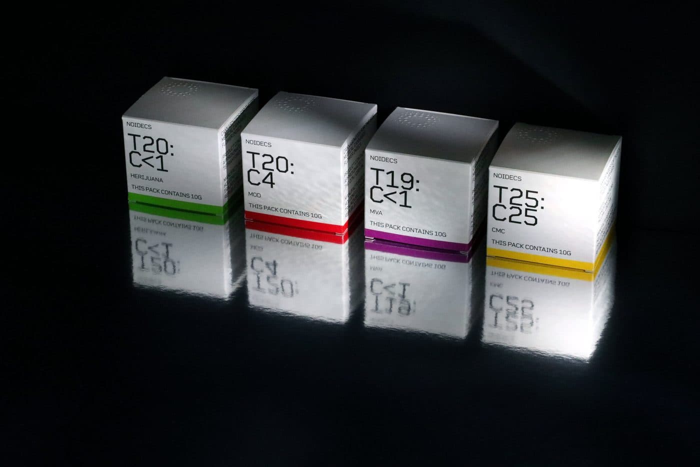
An identity where the THC:CBD ratio is the visual centrepiece — clinical-grade trust, built to scale into international markets.
NOIDECS
About the client
NOIDECS is one of the emerging names in the medical cannabis market, delivering pharmaceutical-grade cannabis products to UK clients while setting its sights on international expansion. Spanning everything from medical flowers to oils, the brand exists to support therapeutic cannabis treatment in genuine partnership with classical medicine — championing wellbeing and natural health benefits without compromising on rigour.
Challenge
Build a brand identity that could carry a dual promise: medically tested, dependable and refined — earning trust in a clinical sense while still feeling considered and premium. No easy balance in a category still fighting for legitimacy.
Approach
Complete transparency for every product: minimalist packaging built around a strong, no-nonsense typeface against a bleached white background. The THC-to-CBD ratio — the most critical factor in any cannabis treatment — became the visual centrepiece, rendered almost algorithmically, like a formula, immediately legible to the clinically minded eye. Pharmaceutical information laid out with the same discipline in crisp, clearly delineated text blocks.
Outcome
An identity where the THC:CBD ratio is the visual centrepiece — clinical-grade trust, built to scale into international markets.